Styling components#
SkyPortal is built on top of Material UI (MUI). We have evaluated several styling systems, including inline styles, CSS Modules, and Styled Components, and have settled on using MUI’s style hooks API.
import makeStyles from "@mui/styles/makeStyles";
MUI provides makeStyles, which takes in JSS (JavaScript Style
Sheets) and returns a CSS provider hook:
const useStyles = makeStyles({
  root: {
    border: 0,
    padding: '1rem',
  },
});
The resulting useStyles can then be used inside of a component:
import Typography from "@mui/material/Typography";

const Text = () => {
  const classes = useStyles();
  return <Typography className={classes.root}>Text</Typography>;
}
It is possible to make nested definitions:
const useStyles = makeStyles({
  root: {
    color: 'red',
    '& p': {
      color: 'green',
      '& span': {
        color: 'blue'
      }
    }
  },
});
This is done via the
& selector:
&p is a p element on root here.
You can also parameterize makeStyles.
Components#
Please refer to the MUI component docs for available components and their props and CSS styles.
Buttons#
Do not use the MUI Button component, instead use SkyPortal’s standardized Button component. Import as such (assuming you are editing a component in the static/js/components directory):
import Button from './Button';
Usage#
There are three accepted button types: primary, secondary, and a regular text button. Use primary buttons for actions such as saving information to the DB or submitting a form. Use secondary buttons and the regular/default button for other actions.
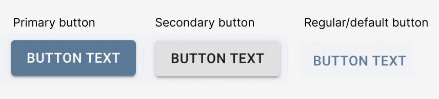
Instead of passing variant and color props, pass in boolean props describing which button you want.
// Primary button
<Button primary>
  Button text
</Button>

// Secondary button
<Button secondary>
  Button text
</Button>

// Regular/default button- no prop
<Button>
  Button text
</Button>
SkyPortal’s Button component accepts all the same props as regular MUI Buttons.
// Add an onClick handler
<Button
  primary
  onClick={() => console.log('clicked')}
>
  Click me!
</Button>

// Small secondary button
<Button
  secondary
  size="small"
>
  I'm small
</Button>
Icons#
Use the endIcon prop for adding icons to buttons. (Do not use the startIcon prop.)
import SearchIcon from "@mui/icons-material/Search";
// ...
<Button
  primary
  endIcon={<SearchIcon />}>
>
  Search
</Button>
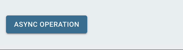
Asynchronous Operations#
Use the async and loading props to make buttons disabled while waiting for an asynchronous operation to complete. Async buttons will always have primary button styling.
const [loading, setLoading] = useState(false)
const waitForAsyncOperation = () => {
  setLoading(true)
  // async operation here...
  setLoading(false)
}
<Button
  async
  loading={loading}
  onClick={waitForAsyncOperation}
>
  Async button
</Button>
Sizes#
All sizes should be specified using rem, which stands for “root
element”—i.e., 1.5rem would be 1.5 times the size of the font-size
specified in the root HTML element.
Style props on Box#
makeStyles is preferred in general, but for simple formatting you
may use style
props on Box
containers:
<Box m={2rem} />
See also “Grid system” below.
Responsive Design#
MUI uses breakpoints as a convenient way of writing CSS media queries.
Breakpoints understand the following pre-defined screen sizes:
xs(extra-small): 0px or largersm(small): 600px or largermd(medium): 960px or largerlg(large): 1280px or largerxl(extra-large): 1920px or larger
While MUI supports several breakpoint operators (up, down, only,
and between), because of confusing logic we only use up:
theme.breakpoints.up(sm): targets screen sizes>= small
Use it as follows:
const useStyles = makeStyles({
  root: {
    backgroundColor: 'blue',
    [theme.breakpoints.up('md')]: {
      backgroundColor: 'red',
    },
  }
});
You may customize media-queries using the
useMediaQuery
hook.
Grid system#
For positioning components on a page, MUI provides a 12-column grid layout.
There are two Grid types: container (outer element) and item
(inner elements).
<Grid container spacing={1rem}>
  <Grid item xs={4}>
    <Paper>Cell 1</Paper>
  </Grid>
  <Grid item xs={4}>
    <Paper>Cell 2</Paper>
  </Grid>
  <Grid item xs={4}>
    <Paper>Cell 3</Paper>
</Grid>
The xs above refers to xs, the breakpoint from the previous
section. In other words, this split of cells will be used from xs
and up.
Multiple breakpoints
can be specified.
You can also leave the value of xs blank, in which case elements are automatically spaced:
<Grid container spacing={1rem}>
  <Grid item xs>
    <Paper>Cell 1</Paper>
  </Grid>
  <Grid item xs={6}>
    <Paper>Cell 2</Paper>
  </Grid>
  <Grid item xs>
    <Paper>Cell 3</Paper>
</Grid>
Do’s and don’ts#
Do not use inline styles
When a list of components are rendered with inline styles, you cannot easily use the web developer tools to modify all of their CSS at the same time (editing one will edit just one instance, instead of all).
Inline styles are spread all over the place, so it is harder to hunt down.
Inline CSS also does not support media queries for responsive design.